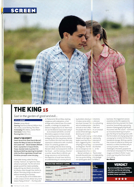
- For this film review, it includes a very big image at the top of the page of a men and a women who seem to be quite close together. From this suggest that they are the main character.
- The columns in this review is very straight forward and has 4 columns.
- The style of the writting is very plain which makes it easy to read and is continuious throughout the whole review.
- In this review the main text is in bold writting which makes it very clear to the target audience and stands out suggesting it is important information. Out of all the text on the review the title of the film is the biggest in black font.
- Also italics is presented on the review for the cast etc. By doing this makes it stand out against the normal font but does it in a more suttle way than makiing it bold.
- The method used to rate the film on this review is the amount of stars awarded which is presented at the bottom of the review against a red block which makes it stand out. Above it also has a comment of the film.
No comments:
Post a Comment